Disjointed brand visuals diluted Quickbase’s no-code promise
Quickbase, a no-code app platform, had a strong technical foundation, but its visual identity and branded materials lacked cohesion and looked dated. This made conveying its value proposition (especially around automating complex workflows without coding) challenging, leading to inconsistent storytelling and diluted brand impact.
-
Collaborative Strategy: Partnered with Quickbase’s marketing and product teams to define brand goals and create visual assets aligned with messaging.
-
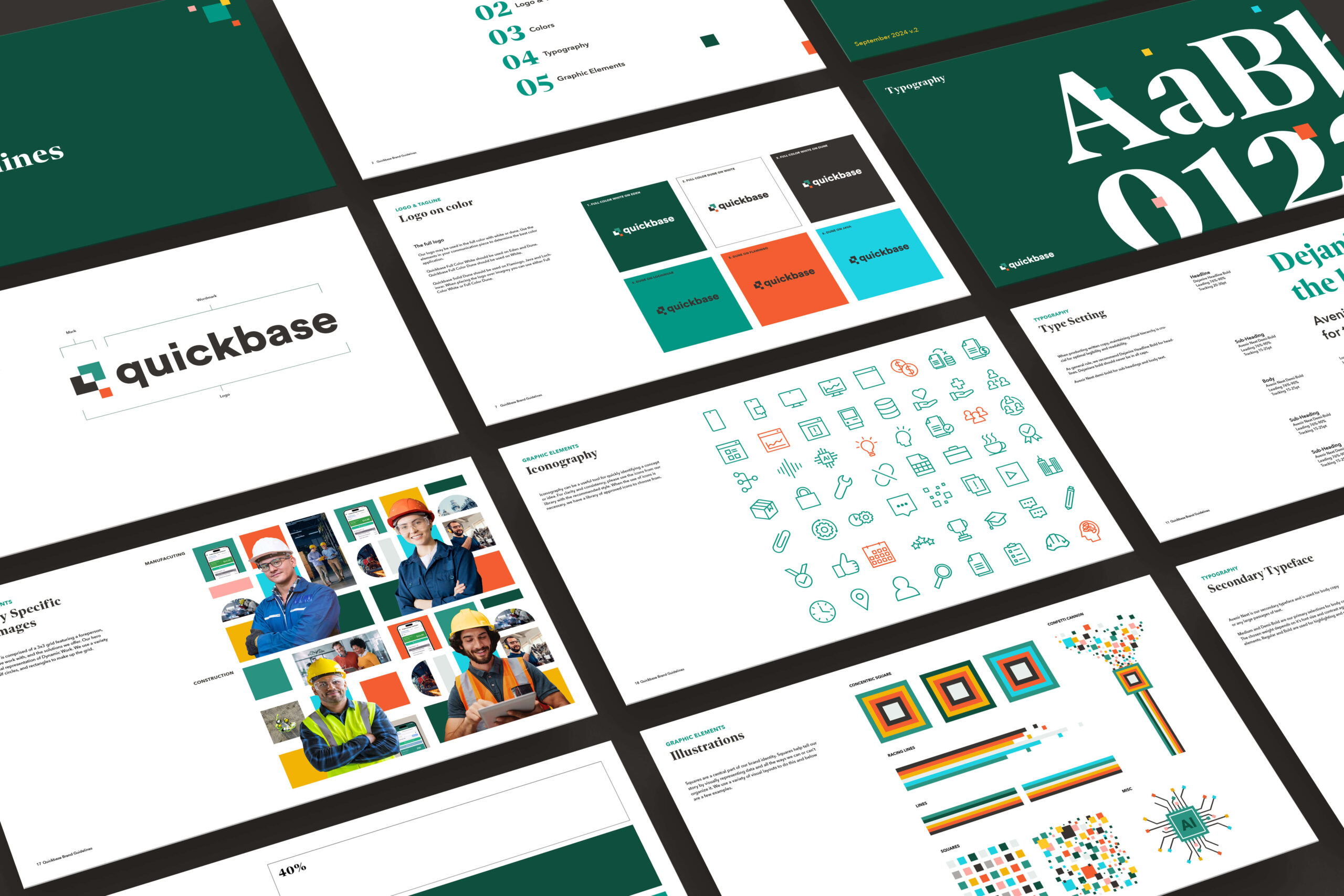
Visual Toolkit Refresh: Developed updated color palettes, typography, and iconography to reflect reliability, innovation, and ease of use.
-
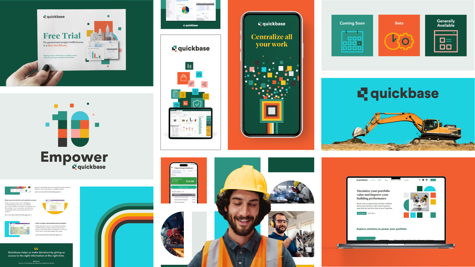
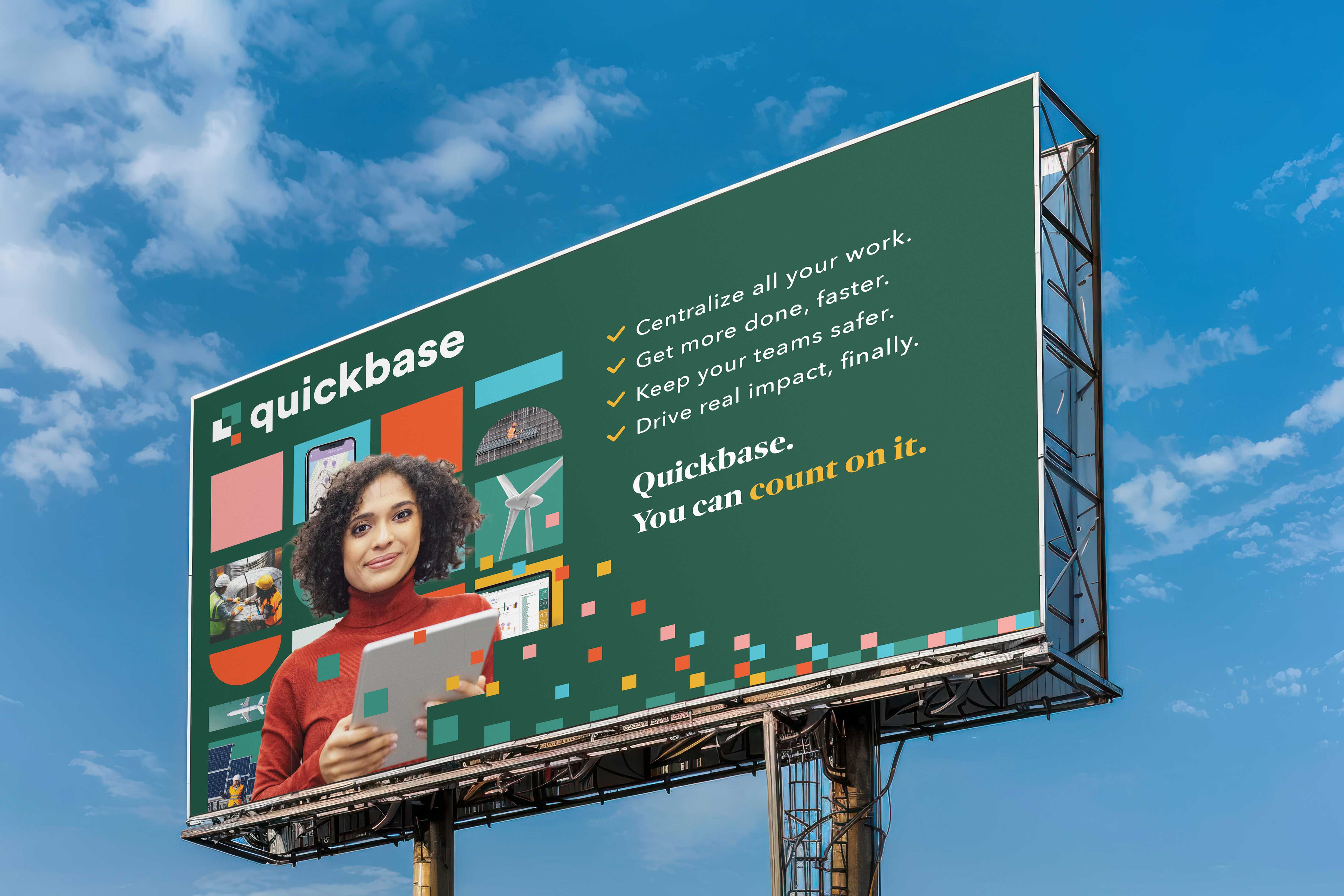
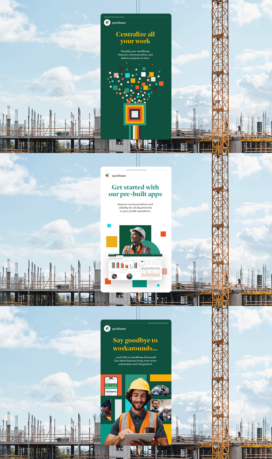
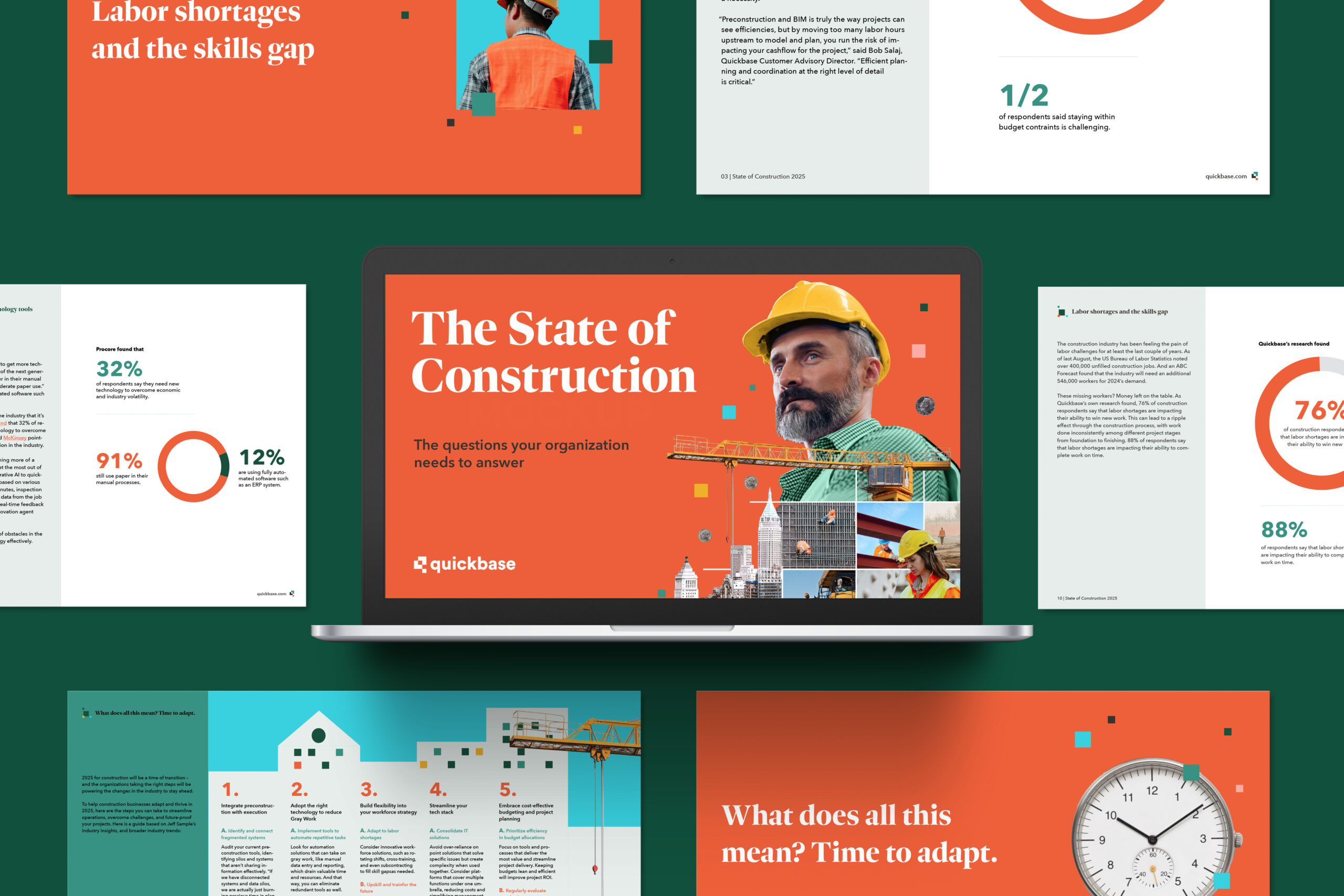
Brand Application: Designed pitch decks, digital reports, and campaign assets that cohesively conveyed Quickbase’s narrative, leveraging structured visuals and consistent messaging to reinforce brand credibility.
-
35% increase in brand recognition in post-launch surveys
-
3x more lead captures at events from trade show booths
-
Enhanced Consistency from white papers and eBooks to digital campaigns
Category: Brand Identity, Marketing, Web
Role: Brand Designer
Team: Molly Sullivan, Rick Frisiello, Chuck Matzker, Tiffany Cuddihy
My Role
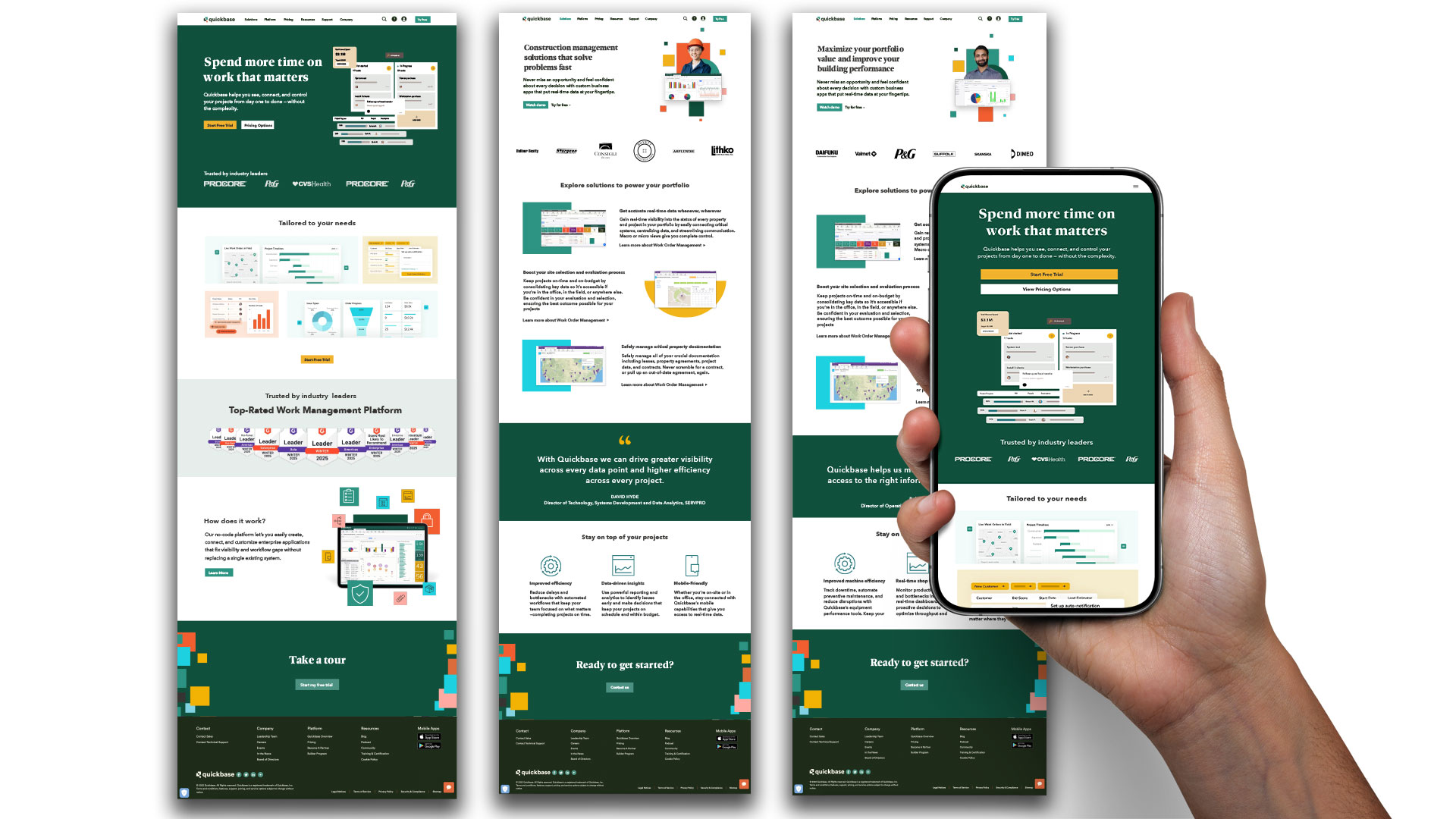
The scope encompassed everything from helping define a modern color palette, revamping iconography for clarity and consistency, and selecting brand photography that better reflected the platform’s human-centered approach. I also created a suite of brand illustrations to visually reinforce key messages and add personality. I collaborated closely with the web team to redesign the website, applying the updated visual language across the site to improve usability and storytelling. I then extended the refreshed identity across marketing materials, from event booths and sales collateral to digital campaigns, ensuring a cohesive and impactful brand experience.

The Before
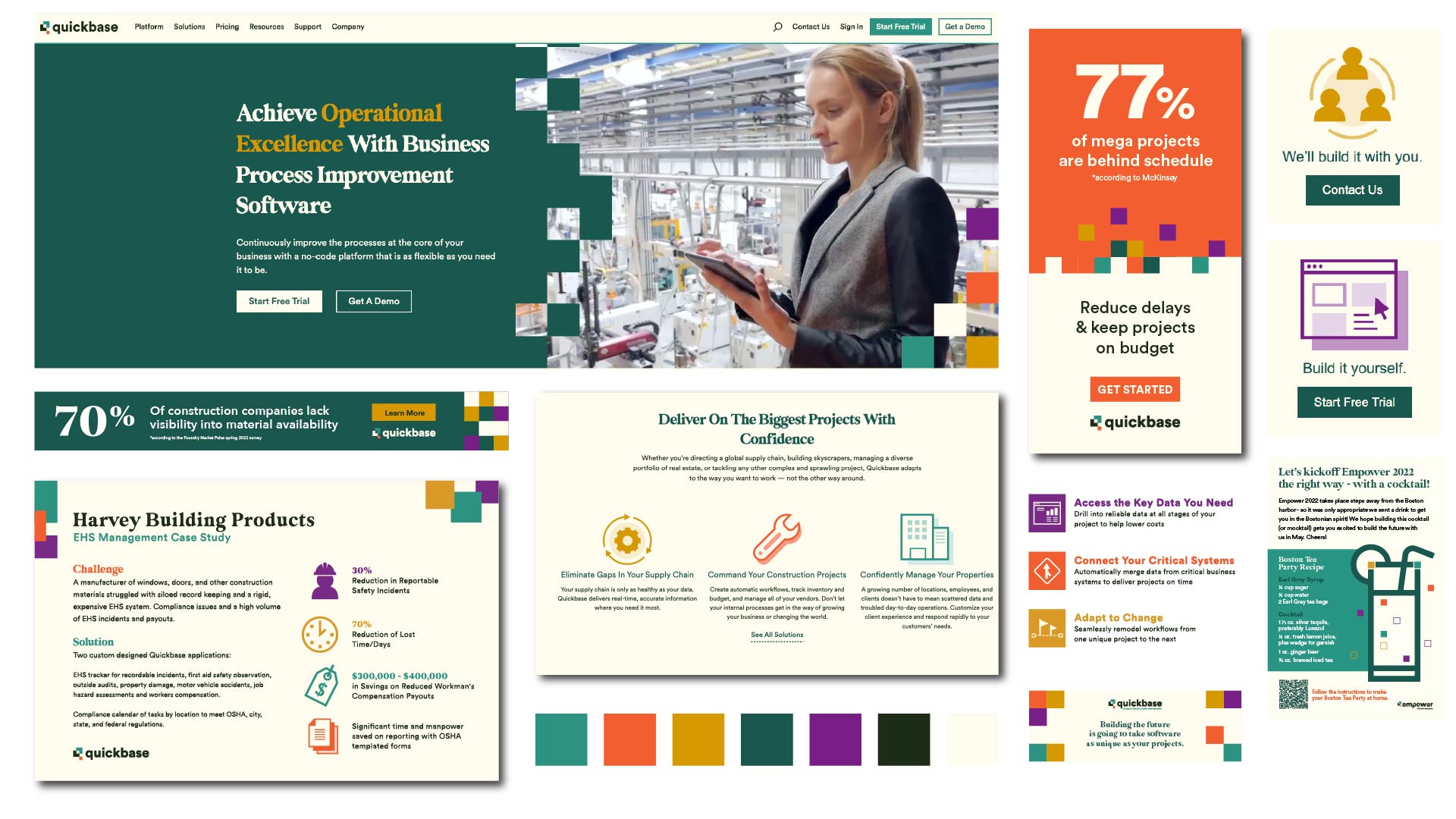
The Quickbase brand from 2018 to 2022 featured a cream background, which was later replaced with white for a cleaner, more modern look. We also reimagined the use of our signature squares and updated photo treatments to create a more cohesive visual system. Icons at the time were bulky and inconsistent, and the typography lacked the refinement needed to reflect our evolving brand.
