Crafting Cohesion for Quickbase’s Flagship Event
Quickbase’s flagship conference, Empower 25, is a multifaceted event—part reunion, part workshop, part inspirational gathering—but their existing branding didn’t fully reflect that energy or cohesiveness. They needed a visual identity and collateral that could encapsulate all three facets while feeling unified.
We designed a dynamic, modular brand system that could flexibly support each component of the event:
-
Conference: Warm, welcoming typography and vibrant accent color to feel like a reunion.
-
Workshop: Clean iconography and structured layouts for clarity and ease-of-use.
-
Inspiration: Bold imagery and energetic compositions to spark excitement. We ensured every piece felt part of the same story, even as it shifted context.
-
Attendees responded positively: feedback surveys highlighted how “fresh and cohesive” the materials felt.
-
Registrations rose by 15%
Category: Brand, Event Marketing, Web
Role: Brand Designer, Graphic Designer
Team: Molly Sullivan, Chuck Matzker, Alissa McCawley, Tiffany Cuddihy
My Role
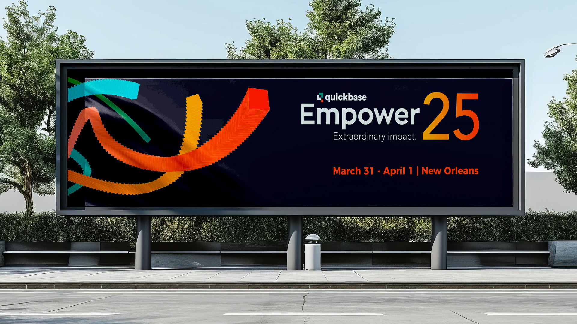
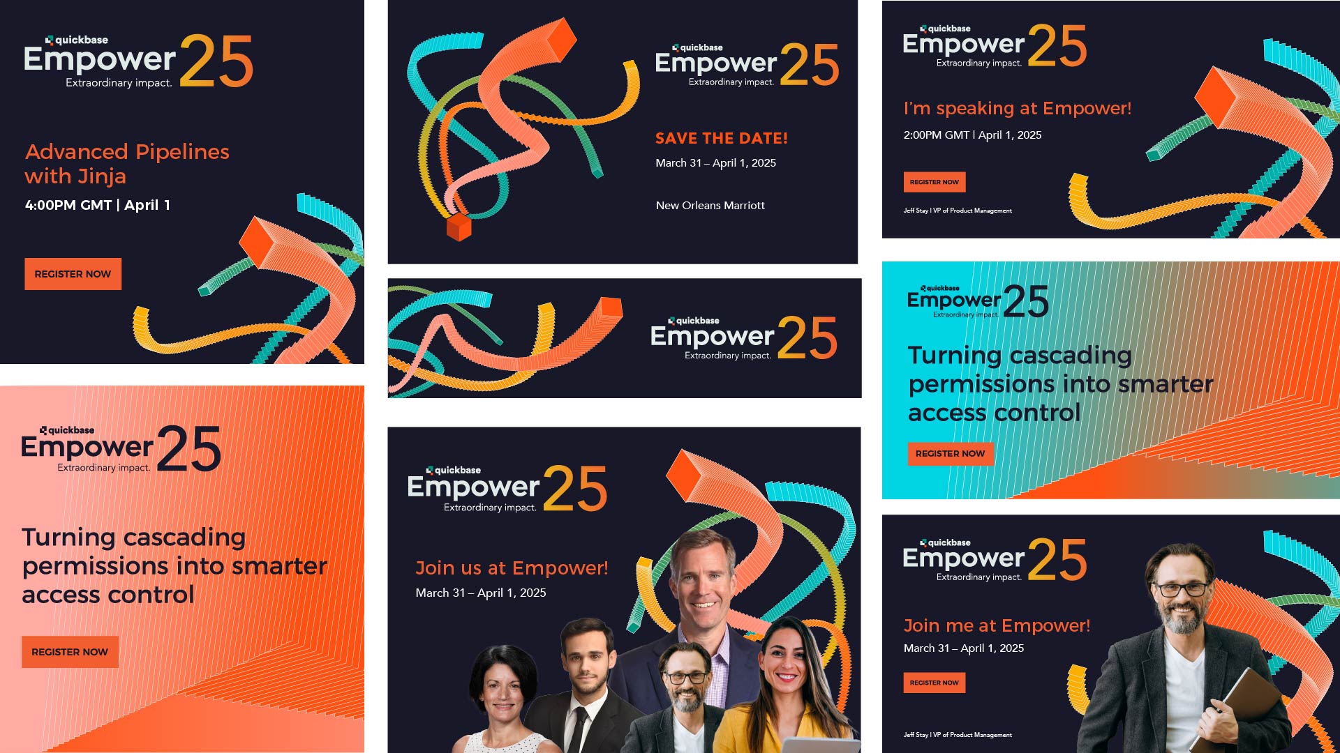
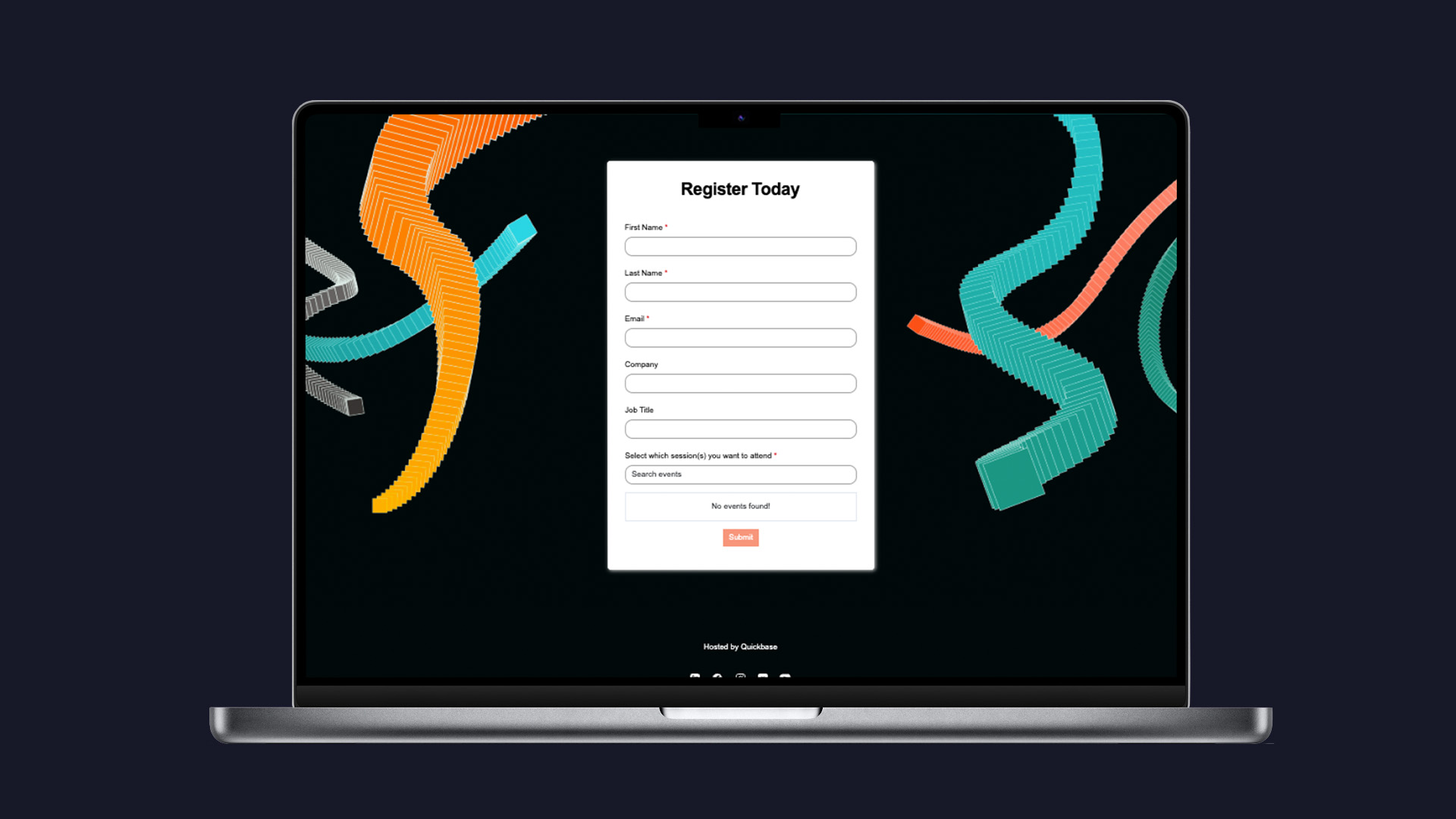
For Empower 25, I helped bring the Quickbase brand to life in a bold, dynamic way. The creative direction was inspired by the theme of extraordinary work—transforming our signature squares into fluid, energetic forms that felt alive and in motion. I was responsible for a wide range of design deliverables, including event promotion graphics for social media, the event landing page, and the registration experience for virtual attendees. I also designed the physical event environment, from exhibit booths and table wraps to branded swag, ensuring a cohesive and immersive brand experience across both digital and in-person touchpoints.
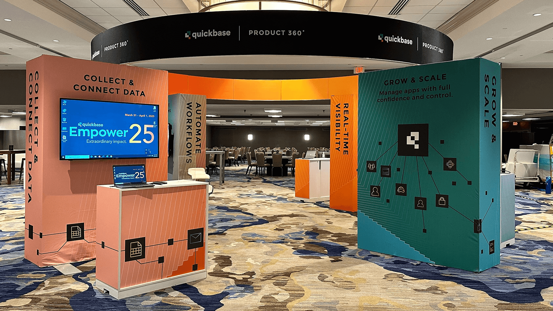
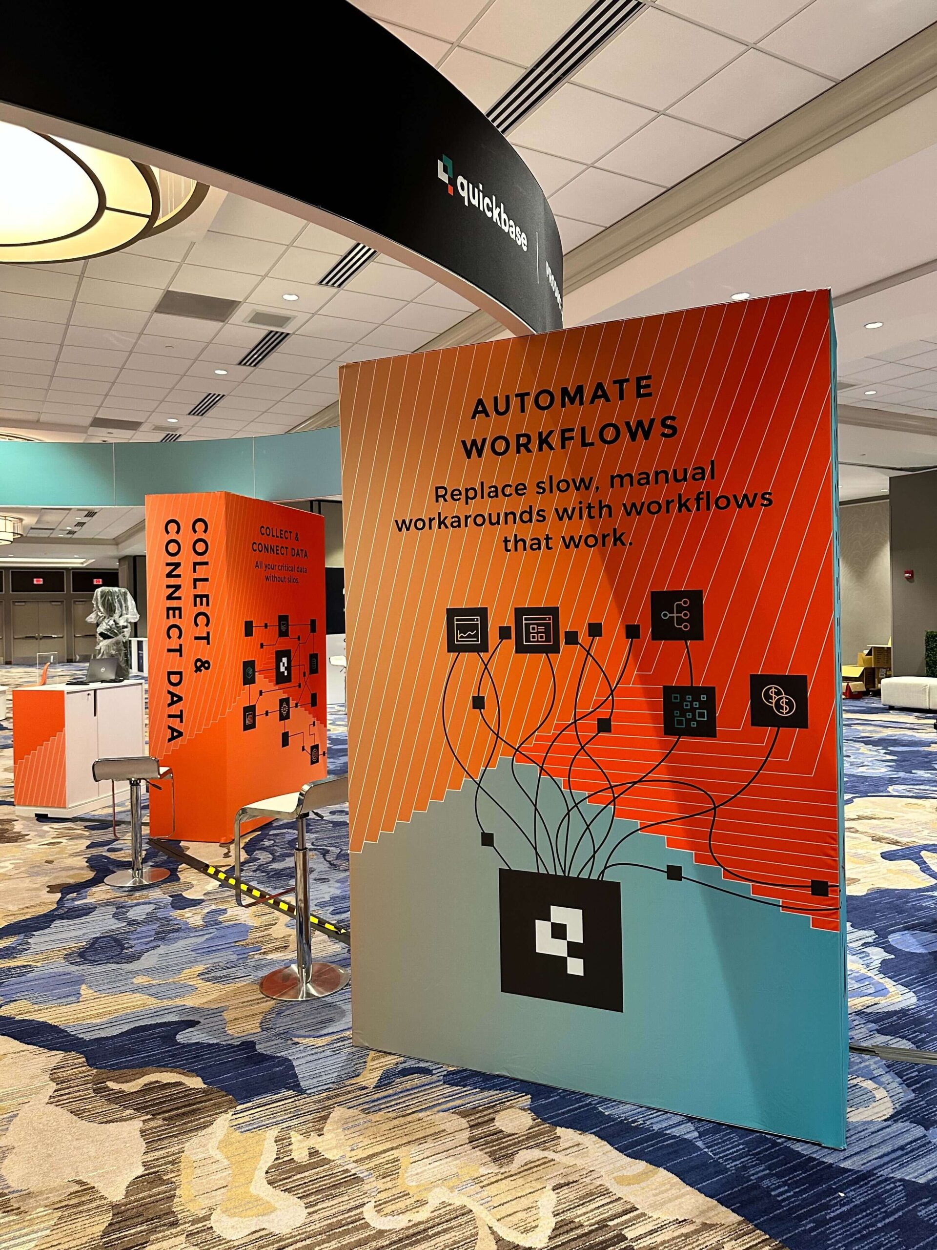
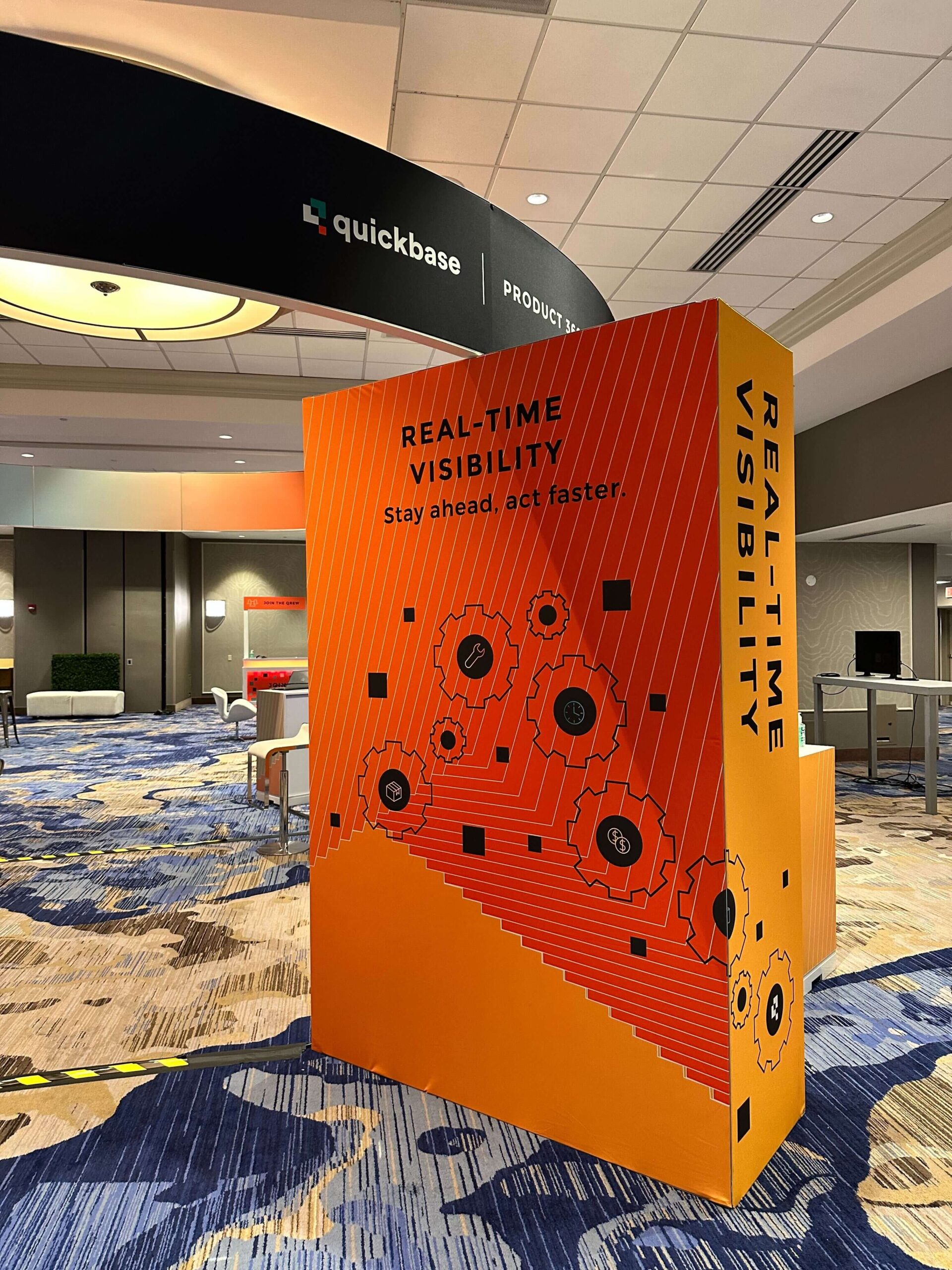
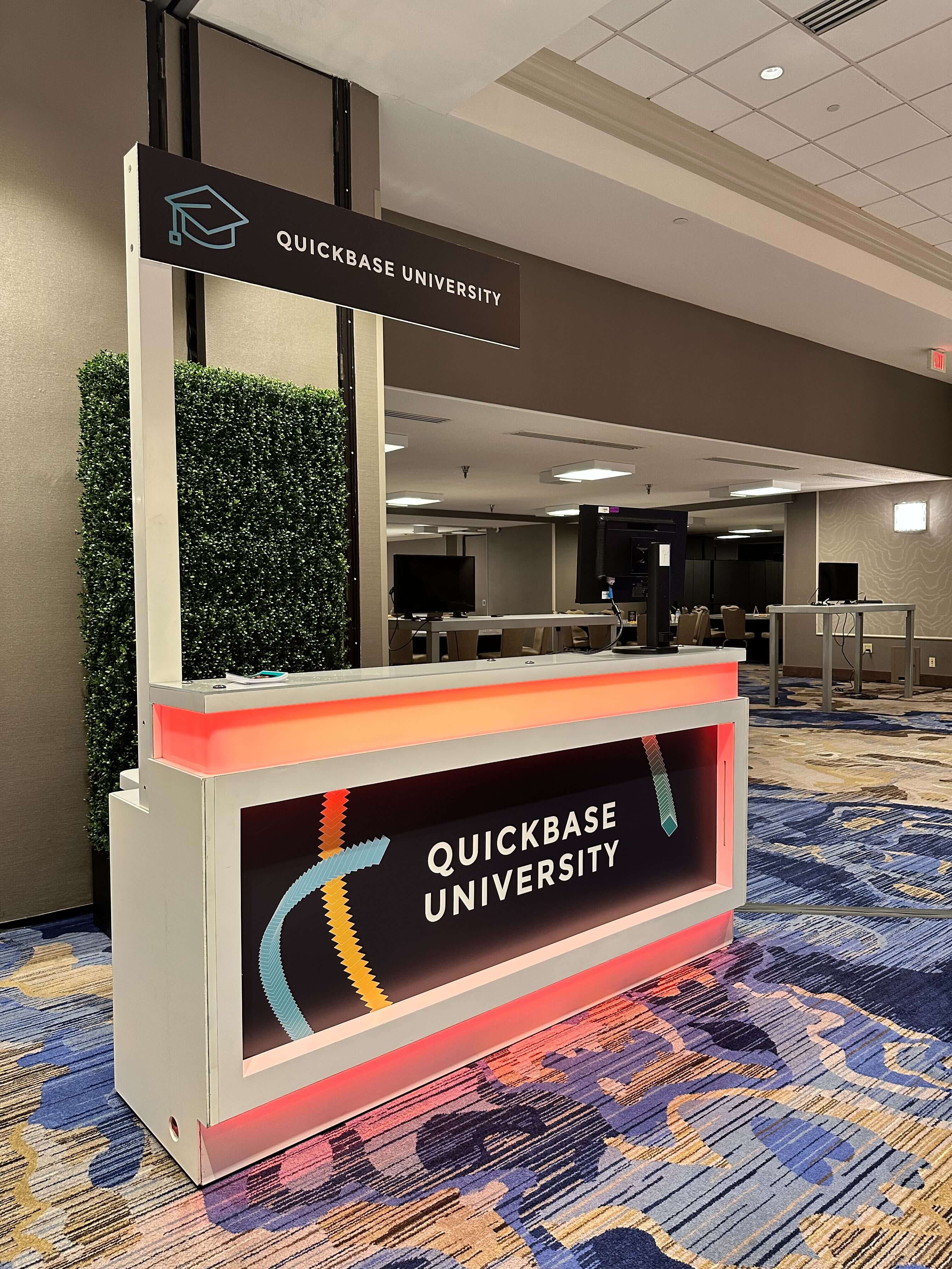
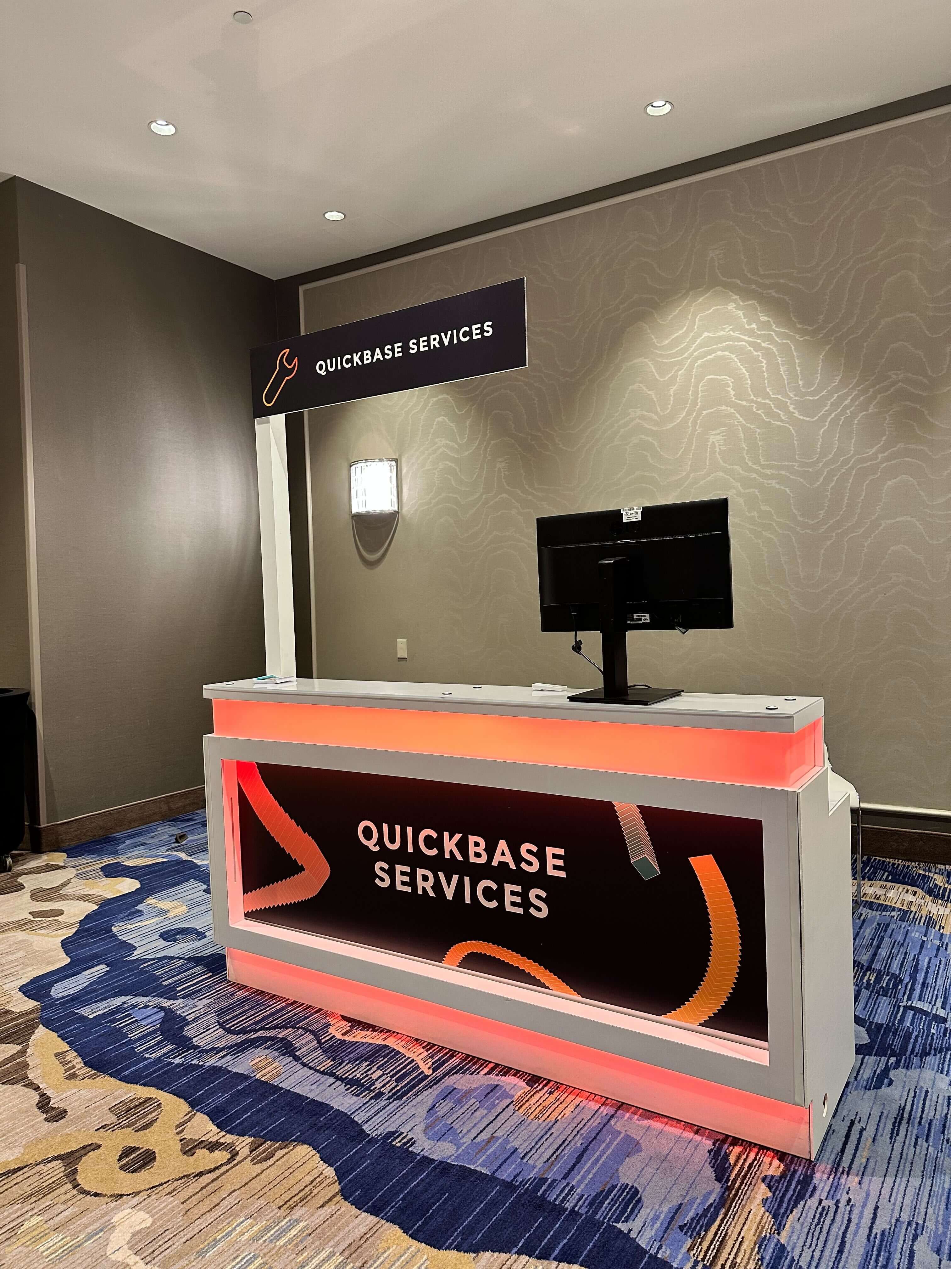
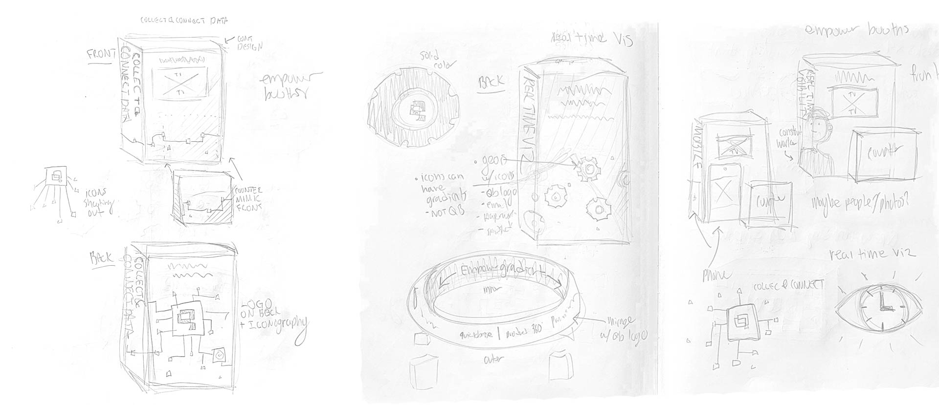
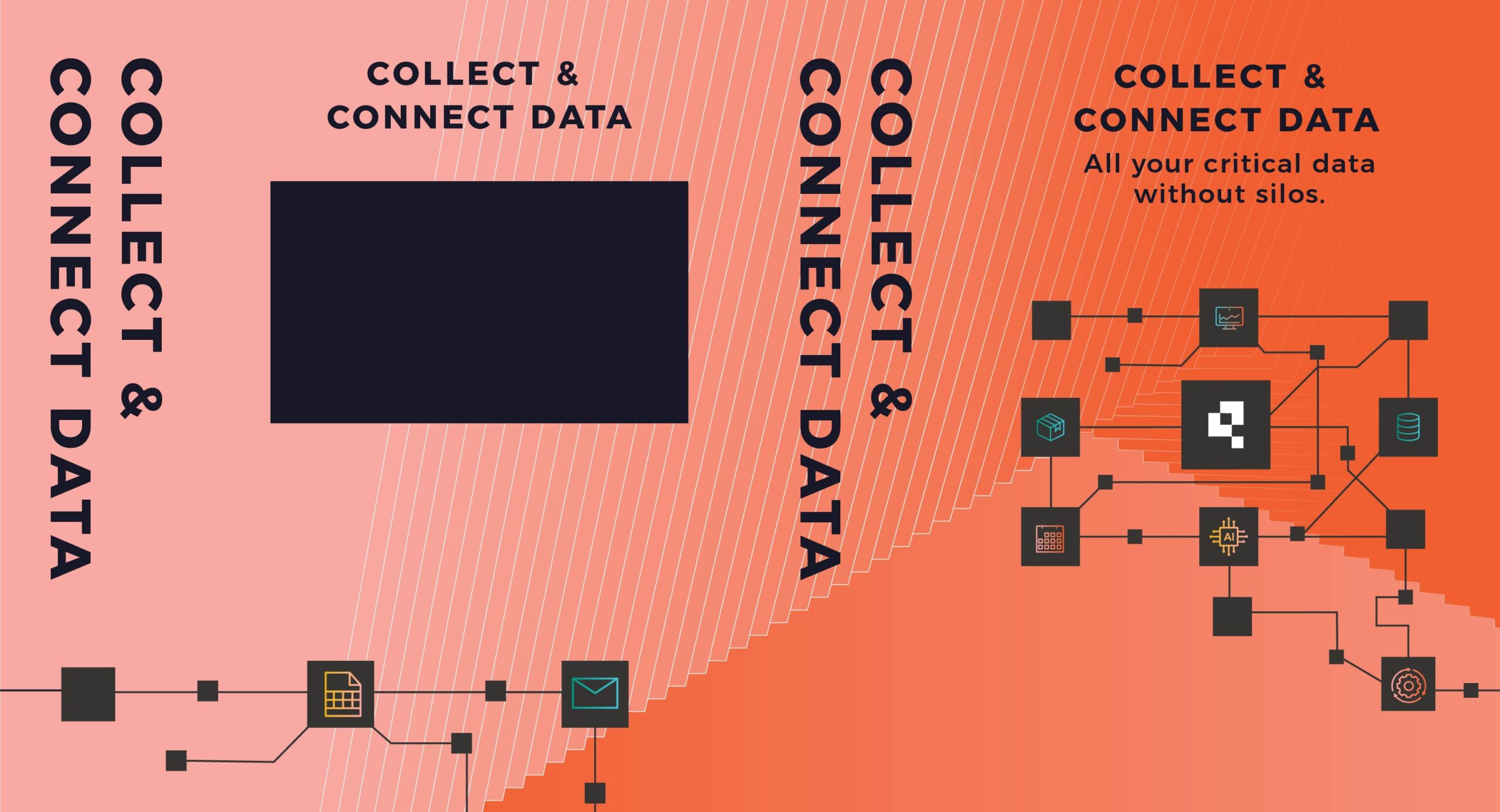
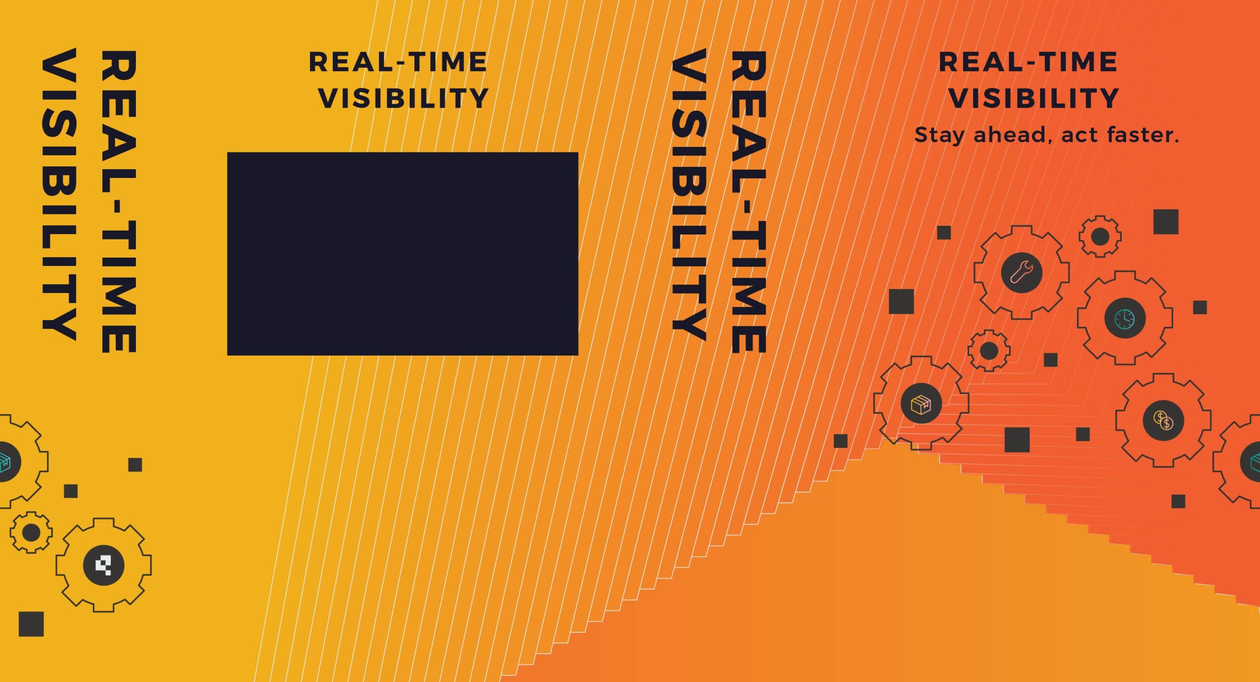
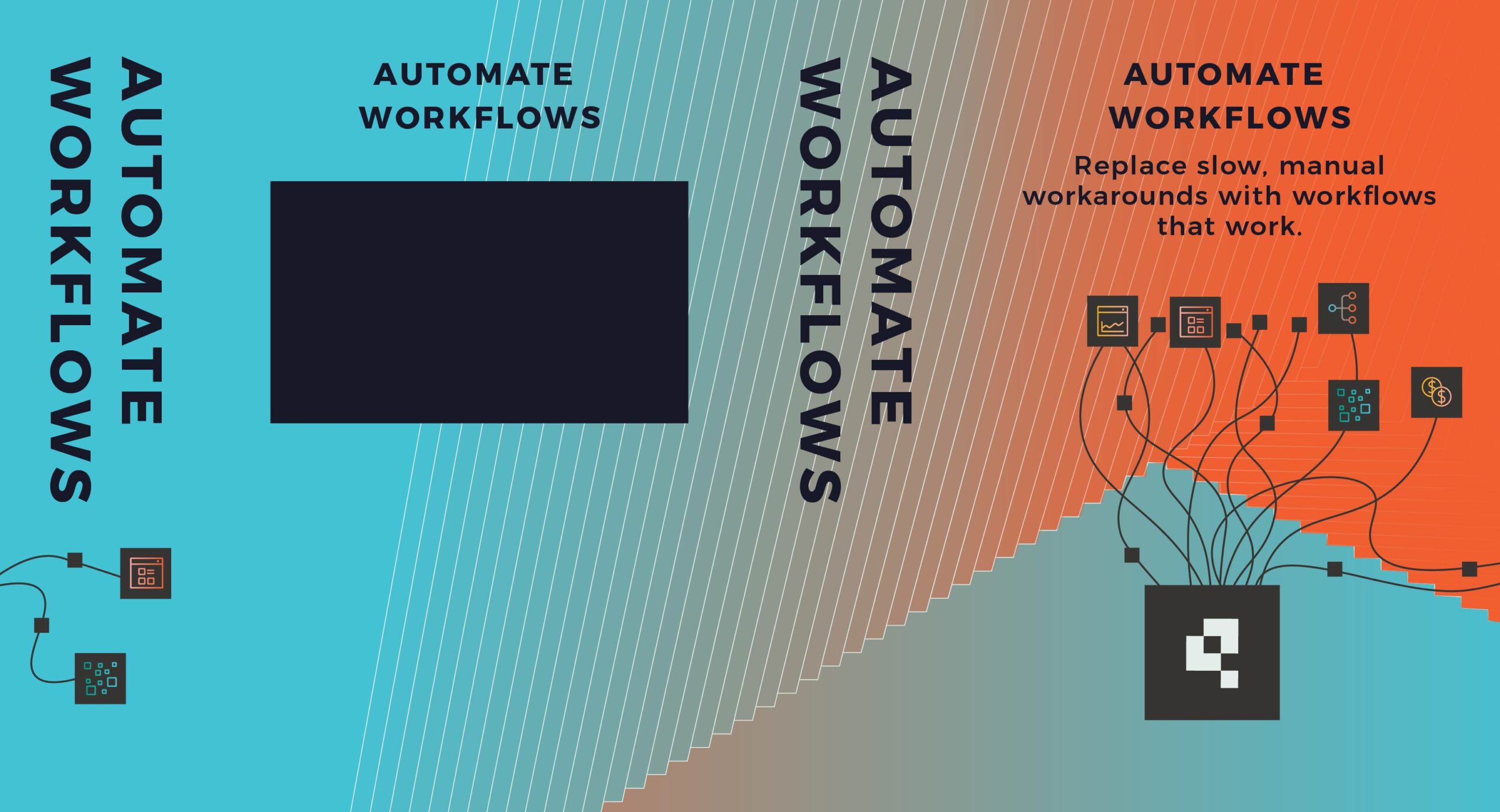
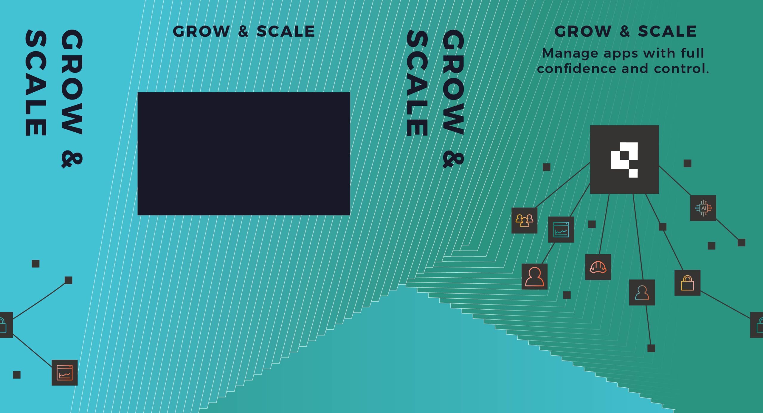
Concept art and booth flats
